Are Real Wages Rising?
Yes, But Here's Why That Question is Harder to Answer Than You Might Think
Thanks for reading! If you haven’t subscribed, please click the button below:
By subscribing you’ll join over 36,000 people who read Apricitas weekly!
The last few years have seen some of the strongest US labor markets since the turn of the millenium—unemployment rates had fallen to generational lows, working-class wage growth hit the highest level since the 1980s, and millions of workers were able to switch to higher-paying jobs as part of the “Great Resignation.” Yet we have also seen an enormous surge in inflation—the Consumer Price Index (CPI) is up nearly 19% since the end of 2019, functionally matching the cumulative price growth seen across the entirety of the prior decade, with costs for food, energy, and transportation skyrocketing. So are American workers still making it out ahead?
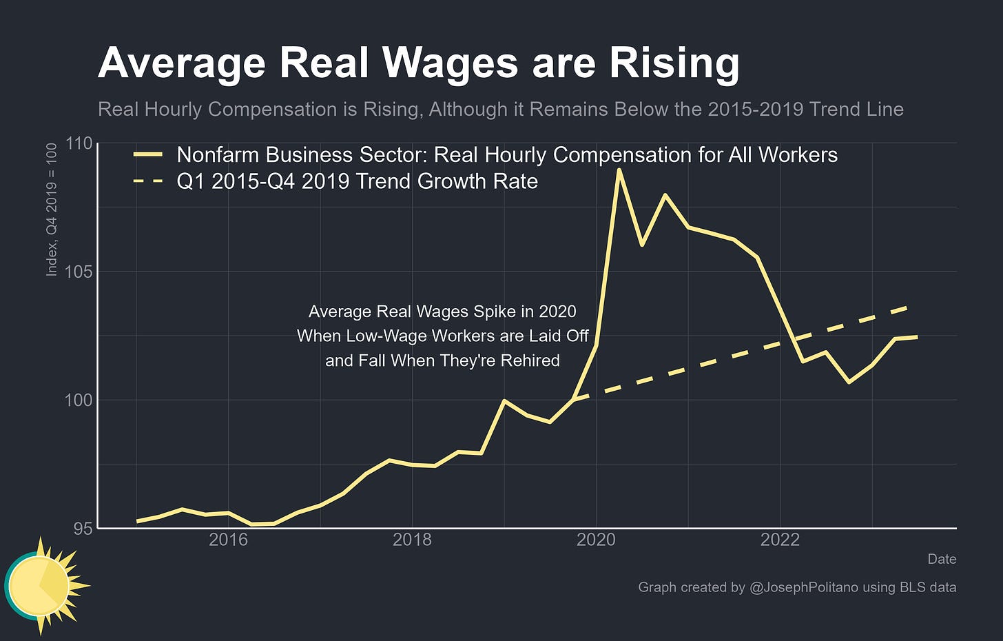
The answer is, on average, yes—cumulative growth in hourly compensation has exceeded inflation since the end of 2019, though it remains slightly below the trend of strong growth seen in the latter half of the 2010s. Yet for how central they are to economic theory and public policy debates, much of the official data on real wages remains ill-defined or poorly measured—often failing to resemble the colloquial meaning of the term and requiring a nuanced look at a variety of data to properly understand.
Measuring real wages suffers from several aggregation problems—it requires compressing the experiences of hundreds of millions of workers and economy-wide prices in order to arrive at one number for analysis, and choices about which wage or price metrics to use can therefore vastly impact the end results. There is also no “right” answer per se—different metrics just provide different advantages and disadvantages. With that in mind, here are the three generally distinct methods for anaylzing real wage dynamics.
Disaggregating the Aggregation Problem
Method 1: How Have Wages Grown in The Economy at Large?
This one is the most common and straightforward, as it just involves averaging out the hourly earnings collected in regular monthly jobs reports or the compensation data collected as part of the official national accounts releases and adjusting for inflation.
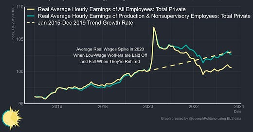
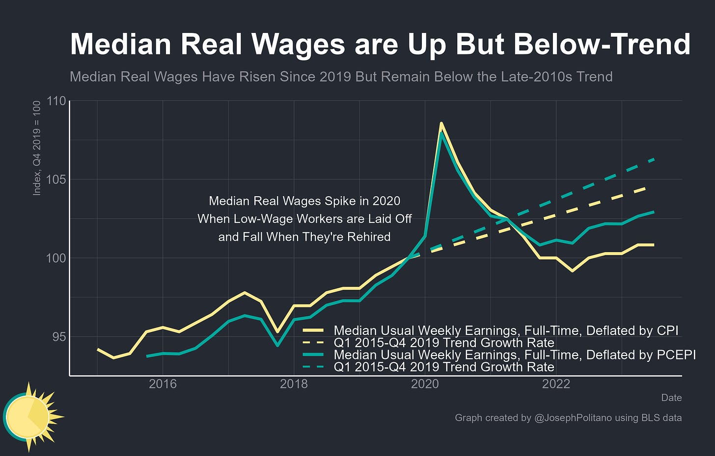
The advantage is that the data is high quality and high frequency, with robust average wage and compensation data reported on a monthly or at least quarterly cadence. The key disadvantage is caused by aggregation—the average can be (and regularly is) distorted by shifts in composition that don’t reflect true underlying developments in real wages. In early 2020, average real wages spiked because low-wage workers were more likely to be laid off than high-wage workers, pulling up the average wage of the remaining employed population, and in 2021/2022 real wages fell as those low-wage workers were rehired, pulling down the average.
Official average real hourly compensation is up since the pandemic but remains slightly below the pre-COVID trendline, and the same is true for real wages derived from the average hourly earnings data. However, real wages for “production and nonsupervisory workers”—i.e., the middle/working class jobs directly involved in service provision, manufacturing, or construction, excluding managers and the like—have risen faster than the overall average and are essentially in-line with what would be expected in the absence of a pandemic.
Method 2: How Have Wages Grown For Occupations or Industries?
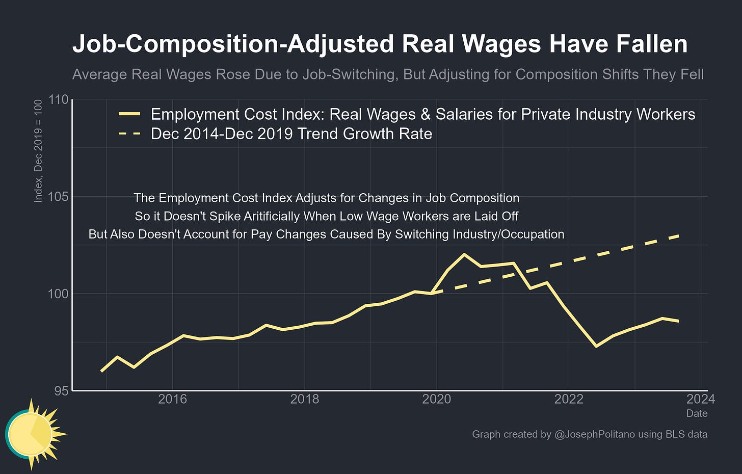
This involves collecting highly detailed data on wages across a variety of occupations and industries, compiling those numbers into an index that reflects the workforce composition at a given point in time, and then holding industry and occupation shares roughly constant as you collect new data and update the index.
The advantage is adjusting for the composition of workers—if suddenly a bunch of low-wage workers are laid off, your data won’t be skewed by average wages spiking, and on the flip side, it won’t be skewed by tanking when low-wage workers are rehired. The other side of that coin is that adjusting for industry/occupation composition erases the large amount of real wage gains that come from workers transitioning into new, higher-paying jobs.
Taking the Employment Cost Index, a comprehensive and composition-adjusted measure of worker pay, and deflating it by the CPI results in decidedly negative real wage growth that is well below the pre-pandemic trend line. In other words, if you imagine the average industry/occupation in America, it likely pays less in real terms than it did in 2019—it’s just that workers have been transitioning from lower-paying to higher-paying industries/occupations at such rapid rates that average economy-wide wages have still grown.
Method 3: How Have Wages Grown For Workers?
Instead of looking at the economy-wide average or pay rates for different occupations, this method involves collecting data on individual workers and intermittently checking in on those same people across time to see how their wages have changed.
The advantage is an unparalleled ability to rigorously track the level and distribution of wage growth among the employed and to easily break down the data across a variety of demographic groups. The primary disadvantage is the data availability (collecting matched records of people employed today and one year ago is extremely resource-intensive, produces a relatively small sample size when done through surveys, and therefore usually needs to be presented as a rolling average that lags real-time labor market developments significantly). Also, there is limited ability to account for any direct benefits or costs of rising or falling employment (a worker who gains or loses a job obviously has zero wages during one of the survey periods so can’t be included in any wage growth calculations).
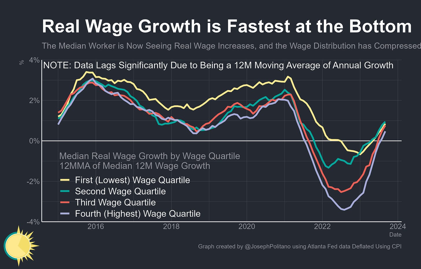
The Atlanta Fed’s Wage Growth Tracker is perhaps the quintessential example of this method—within the same survey used to calculate unemployment, they observe individual workers’ wages twelve months apart and thereby calculate the median growth rate overall and for a variety of demographic groups. Here, it’s clear how strong the negative real wage impulse was in 2022 but also obvious that growth has returned to positive levels this year—although again this data set lags live labor-market developments.
Then there is a secondary problem of measuring wages versus compensation—if a worker’s paycheck remains $25 an hour but your employer starts providing health insurance, that is obviously an increase in workers’ compensation that is not captured by metrics like average hourly earnings or the Atlanta Fed’s Wage Tracker. Since the pandemic, growth in wage and salary disbursements (which includes bonuses, tips, and other direct cash payments) has vastly outpaced employer spending on health insurance, retirement plans, and the like—meaning measures that only encompass wage growth could be slightly overstating recent strength relative to measures of total compensation.
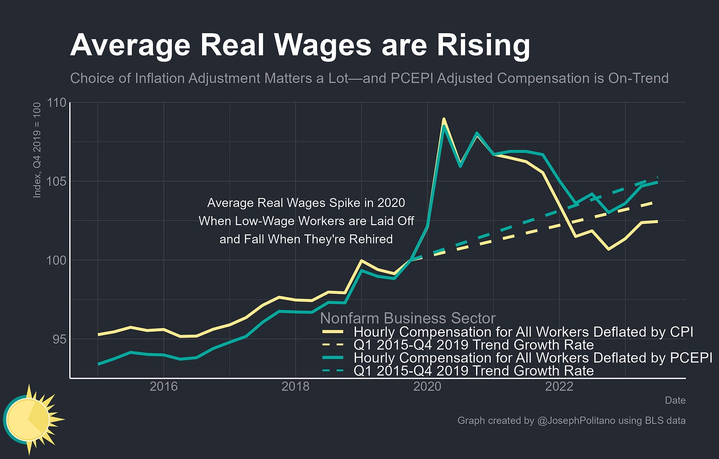
Then there is the thorny problem of deciding which price index to use—so far, we have just measured real wages by adjusting various nominal measurements of wage growth by the CPI. For short-run movements in take-home pay, this is mostly defendable, however, problems emerge when looking at total compensation (CPI explicitly does not account for price movements in employer’s contributions to benefits like health insurance) and when trying to account for large shifts in aggregate prices (CPI tends to overstate inflation for methodological reasons). Here, the better measure is the Personal Consumption Expenditures Price Index (PCEPI) which is what the Federal Reserve targets and what is used to measure aggregate real consumption/income. In this way, real hourly compensation adjusted by PCEPI comes much closer to measuring the share of real economic output (GDP) that accrues to workers—and since 2019, that measurement of average real wages has been much stronger and essentially in line with the pre-COVID trend.
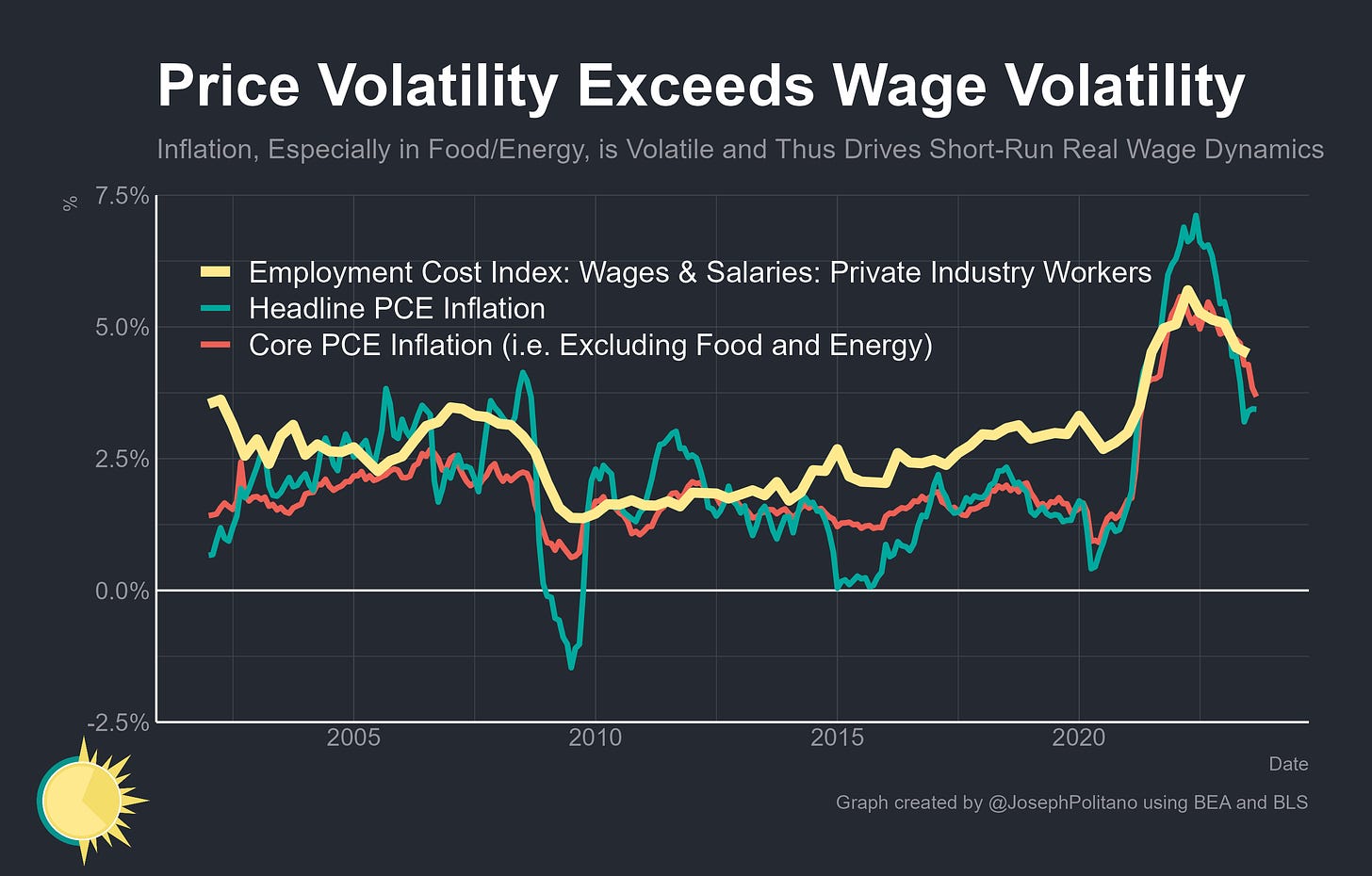
This is good news, and it shouldn’t be that unexpected—the general long-run trend in a growing economy is for real wages to rise and to do so faster when the labor market is closer to full employment. However, it is important to remember that in the short run, wage growth tends to be much less volatile and much more durable than inflation—nominal wages hardly ever shrink, and the difference between a catastrophic year like 2009 and a great year like 2019 is one of only about 2%, while headline inflation regularly dips or surges dramatically. That means that over almost any short-run period movements in real wages are dominated by movements in prices, not labor markets, especially when the economy is hit by adverse supply shocks (pandemic-era supply chain issues, food and energy shortages, etc). Indeed, much of the real wage growth seen over the last year has come as supply shortages eased despite the fact that the labor market has simultaneously cooled with slower hiring, declining nominal wage growth, and the end of the Great Resignation.
Yet, it should be uncontroversial to say that real wages have, on average, increased since the start of COVID—even ignoring actual hourly wage data, it would be extremely hard for real per-capita consumption to rise a full 8.5% and for real output-per-hour worked to rise 5.5% since the end of 2019 without average real wages budging an inch—especially given that aggregate nominal consumption growth has tracked aggregate nominal salary growth so strongly (up 26 and 28% respectively over the same time frame).
Whose Real Wages is it Anyway?
Granting that average real wages have increased since 2019, it’s still important to check on the evolving distribution of real wages—US income inequality is relatively high, so even if average wages are up that could easily reflect growth only accruing at the top end of the distribution. The good news is that median usual real earnings among full-time workers are also up, though they remain below the pre-pandemic trendline.
It’s possible to look at developments in the wage distribution in even greater detail, but with an extremely long lag—the data has to be condensed into a 12-month moving average of 12-month growth because of the limited sample sizes available. Even still, it remains clear that wage growth has been strongest at the lowest end of the wage spectrum, something corroborated by the fast wage growth rates for production and nonsupervisory employees and in traditionally low-wage industries, although low-end wage growth has cooled recently.
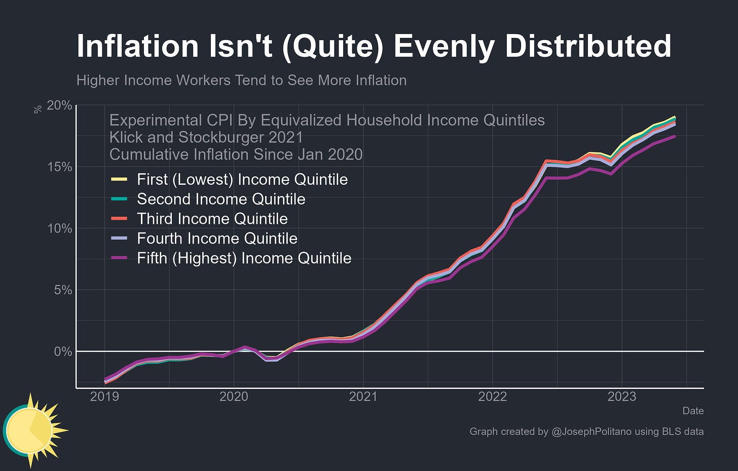
Yet the obvious retort is that those same low-wage workers who saw the fastest pay gains likely also faced the fastest inflation—poorer households spend a larger share of their income on essentials like rent, food, and healthcare that have seen higher-than-average inflation while middle-class households spend more on transportation goods like cars and gasoline that have been extremely adversely impacted by recent supply shocks.
Indeed, since the start of 2020, households in the bottom income quintile have faced roughly 1.5% higher cumulative inflation than households in the top income quintile—enough to partially counteract their higher wage gains. These metrics likely undercount low-end inflation too—data limitations means they are constructed by looking at the share low-income households spend on things like used vehicles but presume that they face similar inflation rates within the used vehicle market, which is probably not true.
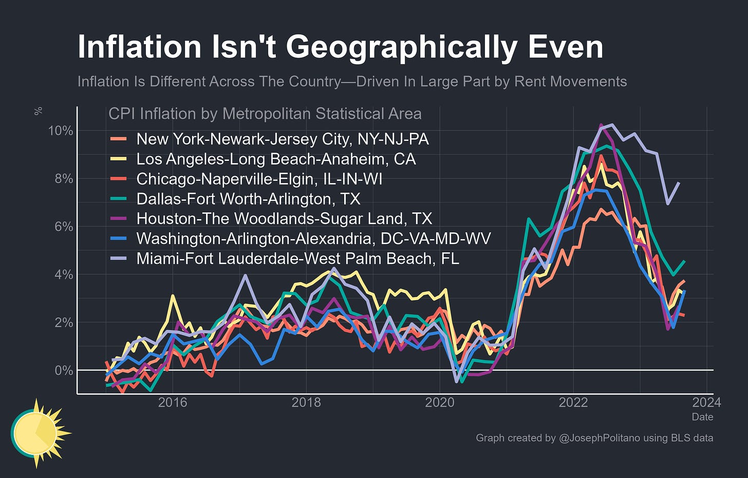
Inflation also varies wildly depending on where you live—the headline CPI is an average of prices across America’s urban areas, but different metros can have different price dynamics. Most tradeable goods (like furniture) tend to have similar inflation rates across the country, but local services (like restaurant prices and especially housing rents) can vary dramatically—allowing major southern metros like Miami to see higher inflation while areas like New York have seen lower inflation during the pandemic thanks in large part to rent/migration dynamics caused by work-from-home.
By the same token, inflation can differ significantly by a demographic—data from the New York Fed shows Black and Hispanic Americans have faced more price increases than White and AAPI Americans since the start of the pandemic, cutting into their faster wage gains. The same is true for non-college educated households, younger households, and rural Americans.
Differences in inflation experiences by demographic are critical, but they shouldn’t be viewed as significant enough to totally overpower the effects of a strong labor market—when you survey people about their inflation expectations indirectly by asking what level of income growth they would need to maintain their current real consumption levels, results are broadly similar across regions and income levels. In fact, low-income households actually tend to expect needing the smallest amount of income growth. Low-wage households likely still have pay gains that beat their inflation rates, the point is that everyone’s individual inflation evolves differently—something that’s fundamentally missed when aggregating prices.
Plus, that’s not the only nuance price indexes still miss—CPI and other inflation metrics base their housing prices data only on rents, but one of the defining economic gaps of the pandemic era is between those who own their homes and those who don’t. Median contract rent has risen from $941 to $1,128 (20%) between 2019 and 2022 while median housing costs for homeowners have risen from $1,124 to $1,244 (11%), with nearly all existing owners benefitting from a large increase in home equity.
Thus, at a basic level, the problem with aggregation persists—the core question most people want to know is not the academic “have average wages risen faster than average prices?” but rather “are people’s individual incomes are rising faster than their individual cost-of-living?” This is an important question (the ongoing Federal research into developing a consumption-based poverty measure is promising in this regard), but it is one you cannot get a wholly satisfactory answer to by just looking at real wages.
Conclusions
Overall, it’s clear that:
Average wage growth since the pandemic has outpaced inflation, though cumulatively real wages are likely a bit below where one would expect in the absence of COVID-19
The real wage distribution has compressed—that is, lower-wage workers have seen proportionally larger gains than higher-wage workers, although this effect is lessened by the fact that low-income households have faced greater inflation than high-income households.
Real wage growth is likely to hold up if the labor market remains strong and the US is able to stick the “soft landing” where inflation normalizes without a recession. Yet it remains at significant risk of cooling or stagnating if the slowing labor market we’ve seen over the last two years worsens substantially.
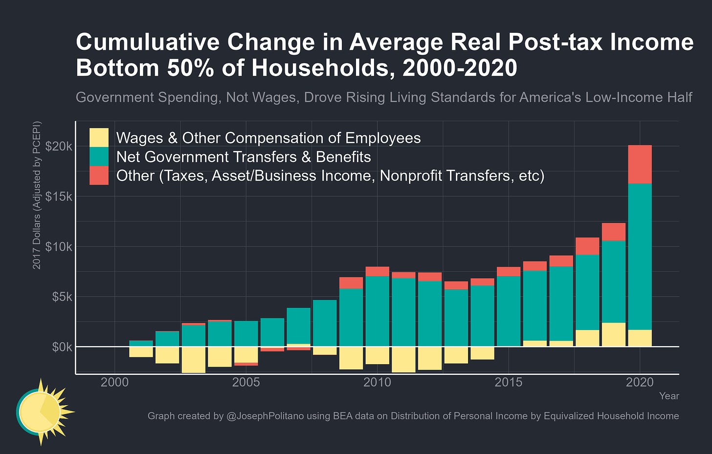
Yet within the debate about American’s living standards, there is also perhaps an overemphasis on real wages as the primary driving force. In the two decades prior to the pandemic, it was rising social benefits that drove income growth for the bottom half of American households much moreso than wages. Make no mistake, this wasn’t an idealized outcome—those decades represented a historically catastophic loss for US labor markets thanks to the 2001 and 2008 recessions and ensuing weak recoveries—but it reflects how looking only at real wage data can paint a partial picture of economic welfare.
The median household with children made $91k in 2021—meaning the 2022 expiration of the expanded Child Tax Credit alone cost them a 2.2-3.5% reduction in nominal income, enough to substantially counteract a normal rise in wages. The expiration of Medicaid’s continuous enrollment provision, which automatically renewed coverage for recipients during the pandemic, has caused more than 10.1M people to be disenrolled from health insurance coverage this year, most of whom for procedural reasons. There is a reason why poverty rates rose in 2021 and 2022 even as employment and real wages recovered from the pandemic—a strong labor market is the foundation of a strong economy, but one still should not expect it to perform miracles.








Very well written and researched.
The Reagan question - are you better off than you were 4 years ago - is a very political one, so I could imagine a lot of pushback by many who feel they aren’t.
Also, there is no decent gauge of cost of living out there. The CPI is supposed to give a rough idea of monetary inflation, but political anger starts when people see their basic spending requirements rise faster than incomes which means taxes, rent, transportation, required insurance & other fees, and basic groceries. John Mauldin called for a CPI index for low wage workers he called the Wal-Mart index, and it was a good idea.
Anyway, I really do appreciate the analysis and charts here. I just felt the need to explain some of the populist anger we see, and express some wishful thinking on something I think the Fed’s economists should measure.
The second method is an interesting explanation for the "vibecession." If real wages within individual industries have dropped, and the vast majority of people have not switched industry...