Thanks for reading! If you haven’t subscribed, please click the button below:
By subscribing you’ll join over 15,000 people who read Apricitas weekly!
Otherwise, liking or sharing is the best way to support my work. Thank you!
Since the start of this year, US economic data has been especially complicated and contradictory. There was a $1 Trillion gap between different theoretically-equivalent official measurements of economic output—Gross Domestic Product (GDP) and Gross Domestic Income (GDI)—and a $665 Billion gap between different official measurements of total wages. When writing about both of those topics I said that we might have to wait months or possibly years to have complete answers on what was causing the discrepancy and what the “correct” numbers were.
Today, we have gained some additional clarity on America’s situation thanks to updates from the Bureau of Economic Analysis (BEA)—and the good news is that many of the gaps in the data shrunk even if they did not close completely. The new economic picture shows America with stronger economic growth in 2021, weaker economic growth this year, and lower wage growth overall.
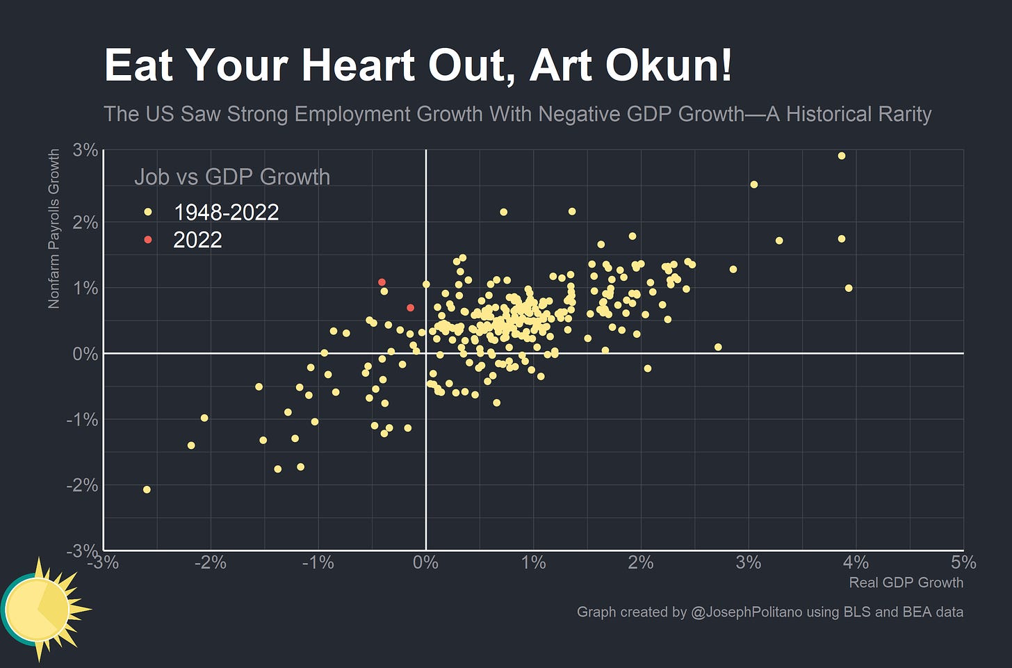
The picture might be clearer—but it remains decidedly weird. Current data shows the US with essentially no output growth in the first half of 2022 but millions of new jobs—and a large gap still remains between different measurements of US wage growth.
Closing the Gaps
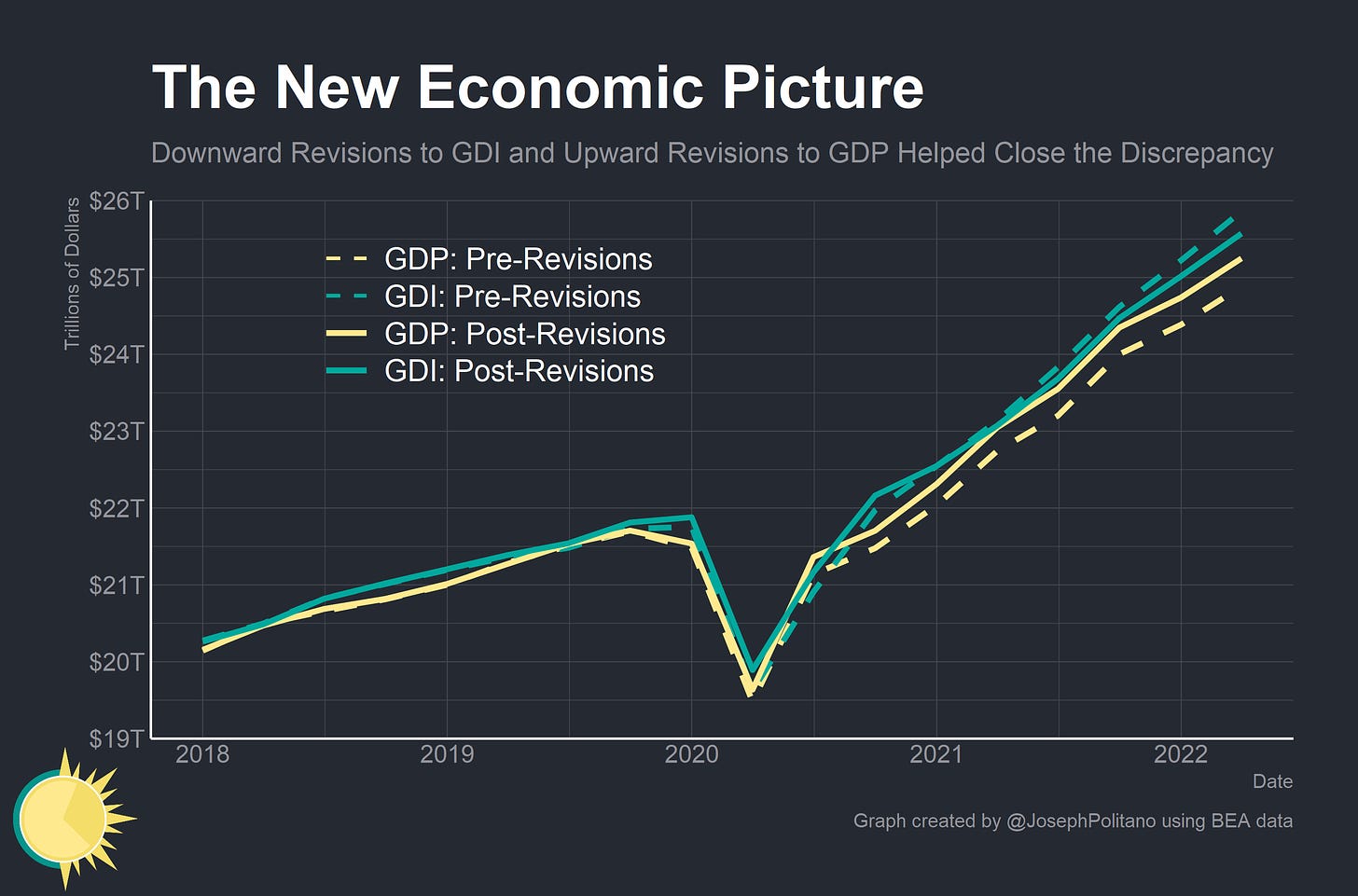
The annual revisions from BEA—alongside the updates to Q1 2022—closed much of the “statistical discrepancy” between GDI and GDP. New data essentially brought the discrepancy from near-record highs to well-within historical averages—and it did so by revising up GDP and revising down GDI. The GDP data was boosted by upward revisions to consumption of services—especially the kind of interpersonal services that were most affected by the pandemic—and upward revisions to US exports of services to the rest of the world.
The GDI data was revised down primarily due to negative revisions to wages throughout 2021 and 2022—something I flagged as a likely possibility when I wrote about the gap between BEA’s estimates and the Bureau of Labor Statistics’ just a couple weeks ago.
Importantly, the changes to GDP and GDI data essentially mean that the recovery looks stronger in 2021 but much weaker in 2022. Before revisions, real GDI data was showing weak positive real growth for 2022—but it now shows total stagnation. Combined with the (essentially unchanged) negative estimates for real GDP growth in 2022, the new economic picture shows decidedly worse output growth for this year.
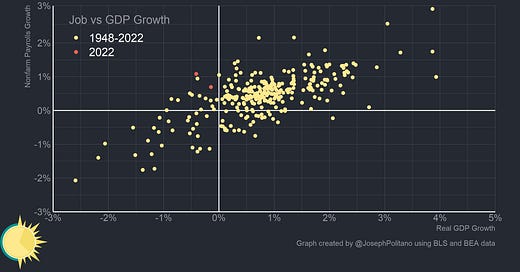
More than that, however, the economic picture is just abnormal. Take Okun’s Law—the idea that there is a correlation between real output growth and job growth. Without getting too much into the empirics or causal debates around it, suffice to say that the two unsurprisingly tend to move together—when GDP growth is positive there tends to be more hiring and when GDP growth is negative there tends to be less. The last two quarters are a historical rarity for having extremely strong job growth alongside strongly negative GDP growth. Job growth hasn’t stopped in recent months either—in fact, nonfarm payroll growth was extremely robust in Q3 and household-survey measures of employment growth were positive as well. The answer to this oddity may come from another oddity—shifts in the distribution of labor income.
Digging Into the Wage Discrepancy
When I wrote about the wage discrepancy two weeks ago I settled on this core thesis—the BEA first estimates wages by extrapolation using the Current Employment Statistics (CES) data from the BLS and then later incorporates more comprehensive administrative data from the BLS’s Quarterly Census of Employment and Wages (QCEW). Since CES data does not include overtime hours, bonuses, or other irregular compensation like stock options or 401(k) matches, the two series can diverge. Usually this isn’t a problem because these irregular compensation items move relatively proportionally to hourly wages—but the pandemic, the ensuing stock market rise, and the labor shortage have all caused disproportionate increases in irregular compensation and therefore larger increases in QCEW than CES. Since BEA’s 2022 wage and GDI estimates were based on CES extrapolations, it was likely they would be revised down when QCEW data was incorporated.
Now that we have updated data, we can reexamine some of those ideas—and the general thesis seems to hold. Manufacturing saw large negative revisions to wage growth in 2021 and Q1 2022 thanks to QCEW data being incorporated to index 2021 estimates and calculate new 2022 estimates. The gap between the CES and BEA estimates has all but dissipated in this sector—which is important since manufacturing is the only CES sector that incorporates overtime hours in addition to the normally-collected overtime pay data.
Outside of manufacturing, however, gaps still remain. In the trade, transportation, and utilities sector (the next-smallest sectoral grouping that BEA produces monthly data for) downward revisions brought the two estimates closer—but a 4% gap still remains. It is by no means conclusive evidence, and there truly is no way to know for sure, but it does suggest that an increase in overtime hours relative to pre-pandemic could be contributing to this discrepancy.
The much bigger deal, however, is likely in bonuses for higher-income workers. The CES-QCEW wage gap is apparent in most industries, but in some much moreso than others. Information—the sector that contains a hodge-podge of newspapers, telecoms giants, movie theatres, and (most importantly for this discussion) technology giants like Facebook and Google—has seen approximately 20% larger cumulative growth in its annual QCEW wages metric than its annual CES wages metric. That’s compared to a relatively-meagre 5% gap for the entire private sector. It’s likely the massive run-up in the stock market, combined with the IPO boom of 2020/2021, and the generous cash bonuses being given to tech workers resulted in a massive increase in the share of income that tech workers received as irregular nonwage compensation. Between Q1 2020 and Q1 2021 QCEW-based aggregate wages in the information sector rose nearly 11% even as employment dropped by more than 1 million.
Growth in this compensation has likely slowed down significantly since then as the stock market tanked and many Venture Capitalists turned bearish—year-on-year information-sector QCEW-based aggregate wage growth dropped to about 7% (compared to 6% annual employment growth) in Q1 2022. San Mateo and San Francisco counties saw large extremely large drops in average wages over the same time period (though this also at least partially reflects more low-wage workers returning to these places). It’s possible that parts of the drop in output have manifested as lower compensation among well-paid workers rather than reduced hiring of working class people. Unfortunately, we’re still going to need more data and patience to fully understand this new economic picture.


US top earners have received big bonuses in 2021, and therefore total wage compensation has been higher. Let’s raise rates steeply so that we bring the US into recession and damage US allies economies.
Just a newbie question, my ignorance of economics is appalling! Do the BEA, etc., data include Contract Labor, Adjunct Faculty data (overwhelming numbers compared to full time/benefits faculty), people who have switched to working at home (non-payroll, consultants, etc.)?