What's Going on With Housing Prices?
A Deep Dive into the Discrepancy Between Home Price Indexes, Private Sector Rental Data, and Official CPI Rent Indexes
The views expressed in this blog are entirely my own and do not necessarily represent the views of the Bureau of Labor Statistics or the United States Government.
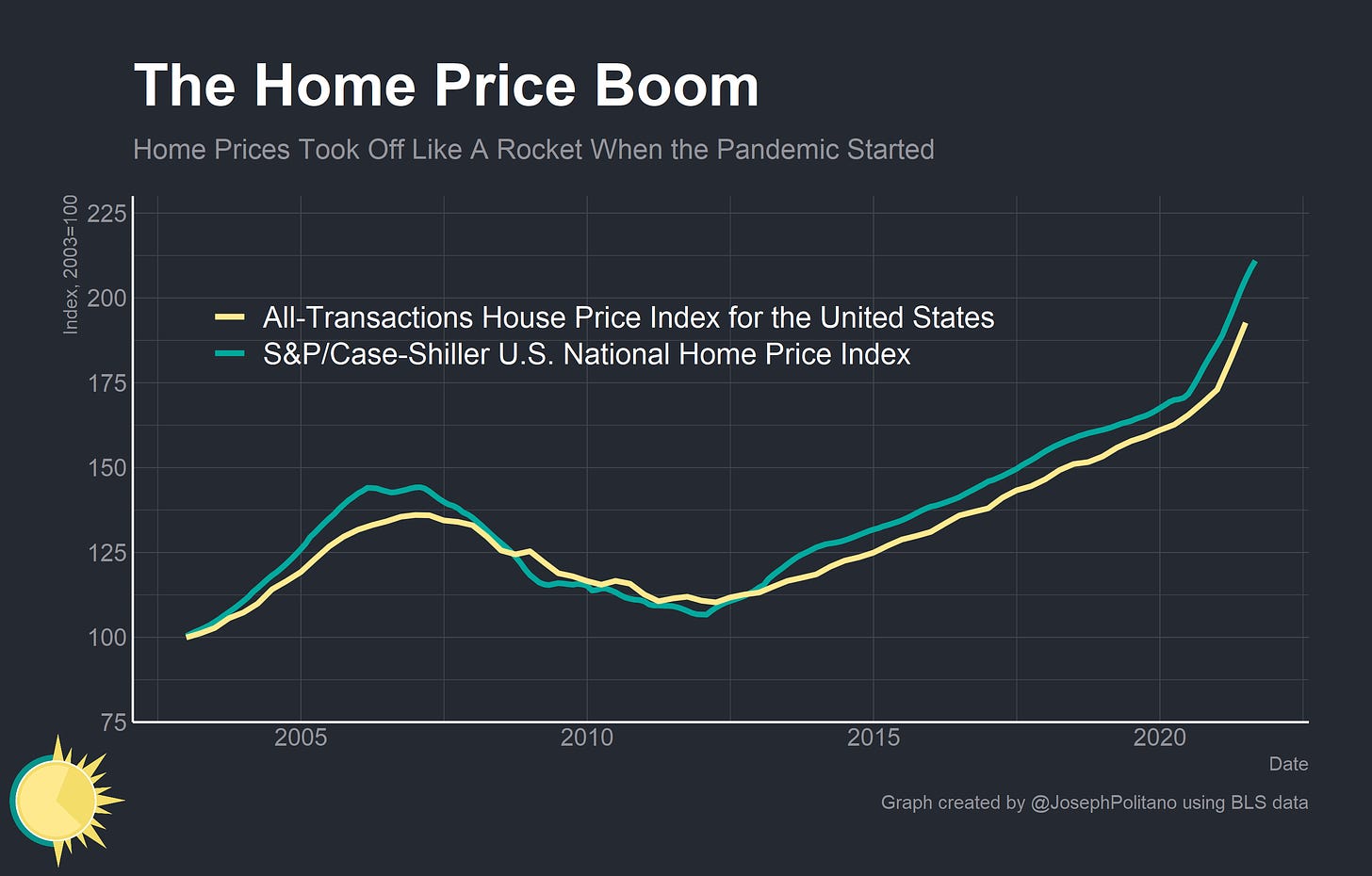
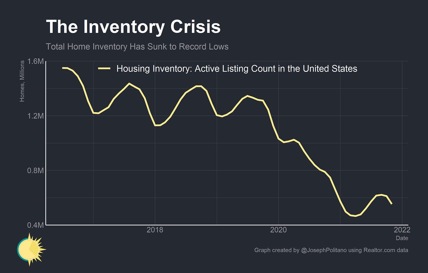
The US housing market, as anyone trying to buy a home will tell you, is crazy right now. Inventory has hit record lows while prices have hit record highs. Redfin CEO Glenn Kelman reported that there are now more realtors than listings. Homes are selling quicker than ever with many frantic would-be buyers placing offers sight-unseen. Home price growth hit double-digits in many cities and the S&P/Case-Shiller U.S. National Home Price Index jumped nearly 20% in the last year.
Private sector data also shows eye-watering rent increases. The Zillow Observed Rent Index grew 14% over the last year while data from Apartment List shows nearly 18% growth. Large corporate single-family home landlords are reporting 17% annual rent increases.
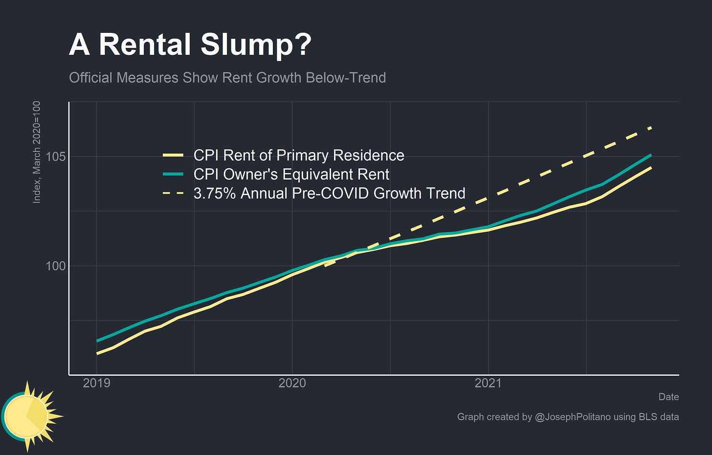
Yet despite the cross-country boom in home prices, official government measurements of housing costs have actually shown a slowdown in price growth. Rent of Primary Residence and Owner’s Equivalent Rent, which together make up about 30% of the Consumer Price Index (CPI), grew only 2% from March 2020 to March 2021. Pre-pandemic, these indexes regularly grew at annual rates of around 3.75-4%.
How could official measurements miss a once-in-a-generation jump in housing prices? Well, they may not be—official measurements are constructed in more robust ways that better capture trends across the entire housing market. Instead, a divergence between rents and home prices alongside some nuanced methodological differences between indexes may be causing private data to overestimate increases in housing costs. However, understanding that dynamic requires understanding home pricing, index construction, migration, housing submarkets, and more. Let’s get into it.
The Home Price Boom
Home prices have been on a tear since the start of the pandemic. The S&P/ Case Shiller National Home Price Index has grown nearly 20% over the last year while the All-Transactions House Price Index jumped nearly 17%. Both of these represent all time highs for the indexes and record-high rates of price growth. What’s driving this massive increase?
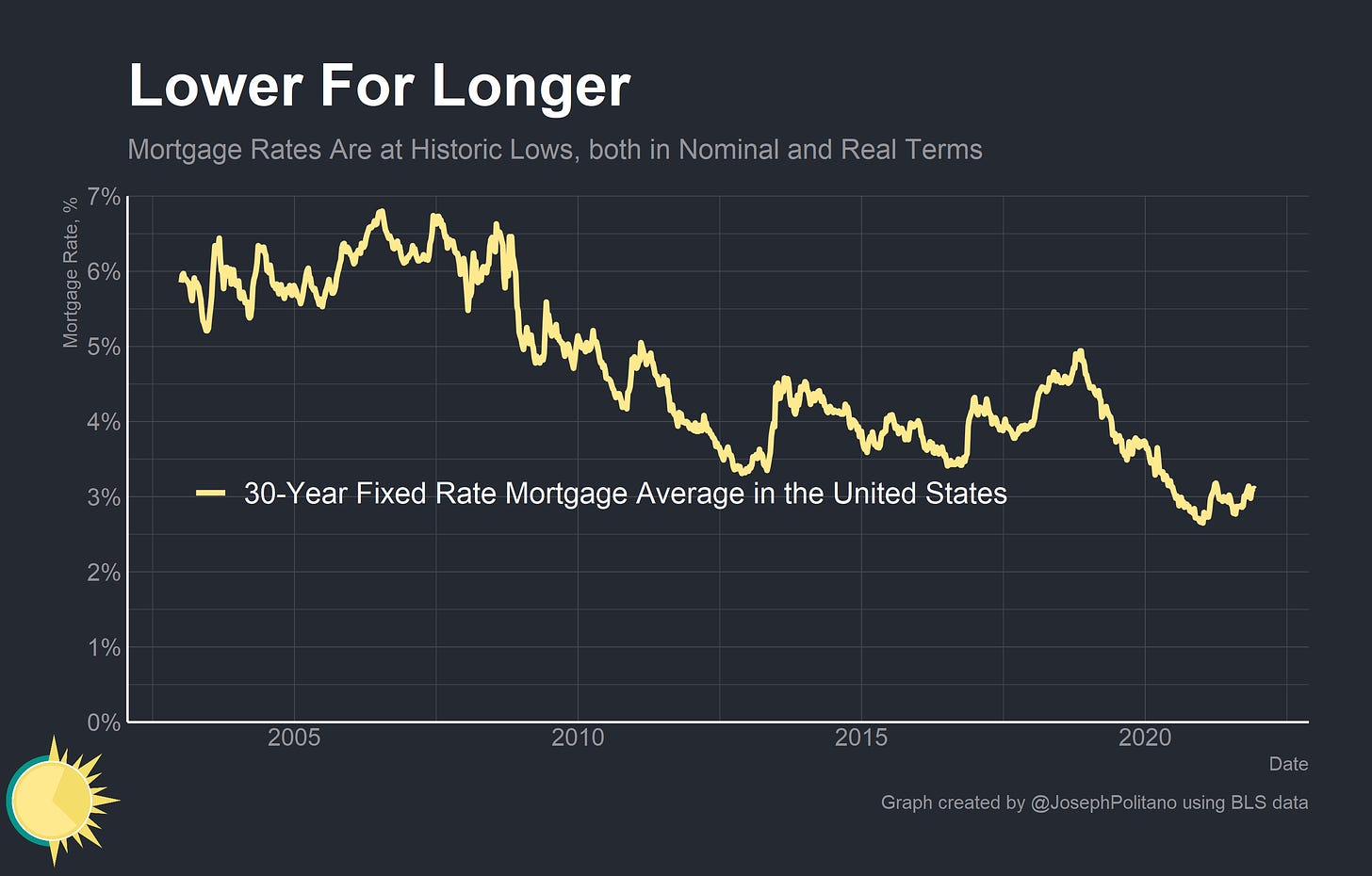
First, it is important to examine the nearly unprecedented drop in mortgage rates (and all long term interest rates) since the pandemic started. Homes are capital assets, like stocks or bonds, and like all capital assets they are priced according to their discounted future cash flows. As such a drop in the discount rate (the interest rate by which future cash flows are, well, discounted) will mechanically raise the price of homes. The recent drop in rates has been nothing short of historic—the average 30 year fixed mortgage rate dropped from 4.9% in late 2018 to 2.6% in early 2021. This is extremely large given that a user cost model would estimate a nearly 30% jump in home prices if interest rates dropped from 3% to 2.5% and rents remained the same. In inflation-adjusted terms the drop in interest rates has been even starker.
It is also important to acknowledge that rents have not necessarily stayed the same. Even if the pandemic did temporarily drop current rents (as is the case in cities like New York and San Francisco) it may have increased expected future rents for when the pandemic ends. This would boost home prices even if today’s rents were shrinking or barely growing. Indeed, NYC and SF are seeing home prices rise even as market rents fall. Finally, a reduction in risk may have also buoyed home values. Increased risk lowers the price of capital assets, as anyone who has studied the stock market will tell you. Seeing the federal government prevent many foreclosures through mortgage forbearance, stimulus checks, and expanded unemployment insurance may have significantly lowered the long term risk of homeownership and thereby increased home prices.
Another factor influencing home prices is the drop in available inventory and intense competition among buyers. Homebuyers, especially first-time homebuyers, unsurprisingly exhibit somewhat impulsive and emotional decision-making when buying a home. This often leads them to overpay for housing on the margins, especially when under pressure. The conditions of the current housing market—with buyers placing bids significantly above asking prices, waiving contingencies, and making offers sight-unseen—may be pushing buyers’ offers higher on the margins. With the average home selling in just over two weeks many would-be homebuyers feel they simply have little to no leverage in negotiations.
It is also worth acknowledging at this point that the home price indexes have some known biases that may be affecting their numbers. For one, both the S&P/Case Shiller National Home Price Index and the All-Transactions House Price Index only measure single family homes. While the majority of Americans do live in single family homes, an additional 17% live in multifamily units. The S&P/Case Shiller Index also has a well-known bias towards large, coastal cities and towards older housing stock, both of which may be affecting the index’s results. More importantly, both of these indexes may be suffering from intense sampling errors. If homes that have sold during the pandemic tend to be the homes with the highest price appreciation (a reasonable conjecture given changing migration patterns and the pandemic forcing many less fortunate homeowners to remain in their homes) then the recent sales data for both of these indexes may be biased significantly upwards. Indeed, it is sampling issues that may also be causing the divergence between private and official measures of rental prices.
The Rental Mystery
Over the last two years, housing costs as measured by the CPI have run well below the pre-pandemic trend. Rent price growth has only picked up recently and will need to accelerate further before it can catch up to the pre-pandemic trend. This is despite unprecedented growth in home prices and private sector rent indexes.
To understand this divergence, you must first understand how the Bureau of Labor Statistics (BLS) measures rent prices for the CPI. Home sale prices themselves do not factor at all into the CPI. As far as the BLS is concerned, homes are an investment that produce shelter, which is the consumption good that the Bureau actually wants to measure. The core logic of this is sound—rents are only the current cost of shelter, while the price of home prices include the current cost of shelter, the expected future cost of shelter, the risk of homeownership, and the expected path of interest rates. When measuring inflation rent prices are the only thing that matters.
The BLS goes to great lengths in order to properly measure these prices. A nationwide housing sample is constructed by selecting representative rental units from a cross-section of location segments in each of the 87 CPI pricing areas. The Bureau then asks the tenants, landlords, or property managers at these housing units about their current rent. This is done every six months so that only 1/6 of the sample is included in any given CPI print. The Bureau then corrects for things like the ageing of housing units, rental vacancies, refurbishments, and so on until they arrive at the CPI Rent of Primary Residence Index.
Owner’s Equivalent Rent (OER) is trickier to create. The BLS has to measure housing costs for people who own their own homes, a difficult proposition since these people do not pay rent directly. To construct the OER index the BLS essentially measures the rent on a homeowner-representative sample of tenant-occupied housing units. The OER measurement is therefore also drawn from direct measurement of rents paid by tenants.
I want to make this point extremely clear because it is the source of tremendous confusion online. The OER measurement is not drawn by simply asking homeowners what they believe the rent on their homes would be. Famous hedge fund manager Bill Ackman claimed that owner surveys are used to measure housing prices and that inflation is therefore understated, which is so wrong as to be nearly misinformation. The surveys of homeowners are only used to construct the relative weight of OER within the CPI. All measurements of shelter costs come directly from the Housing Survey of rental units.
In fact, the BLS’s method sacrifices a lot of timeliness in order to achieve additional precision. Since the CPI reflects actual prices paid for a representative sample of housing units, it takes time for lease turnover and regular rent hikes to be reflected in the index. Movements in private rent trackers and new leases usually precede movements in the CPI’s housing indexes by several months. It took until mid-2009 for CPI’s housing metrics to show any significant decline as a result of the Great Recession, well after it was widely apparent that housing costs were falling. However, these methodological choices give it a robustness not found in any private data tracker.
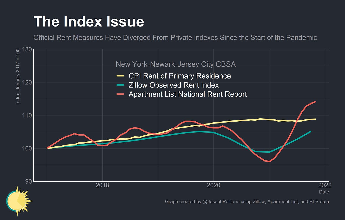
Take the Zillow Observed Rent Index (ZORI) and the Apartment List National Rent Report, two of the most widely-used private rental datasets. Both of these datasets moved generally in lockstep with the CPI—until the pandemic hit. At that point the private indexes diverged downward significantly until approximately 2021, at which point they rocketed ahead of official statistics.
To understand this phenomenon it is critical to understand the methodology used by these private indexes. Both are repeat-rent indexes (meaning they track the same properties over time) based on realized transaction data. Both indexes also use Census data to correct for biases in the sample of units listed on their respective websites. So if Census data indicates that 30% of units in a given area are single family homes but Zillow listings in the area are only 15% single family homes, ZORI corrects for this.
Despite their best efforts, private data has become extremely volatile since the start of the pandemic. Take the New York City statistical area. Note that this does not include only the New York City limits, but all towns directly economically linked to NYC. This means most of southern New York State and northern New Jersey. Since the start of the pandemic, official CPI measurements have detected little movement in rent prices. Yet both Zillow and Apartment List data show 10% swings in rent prices.
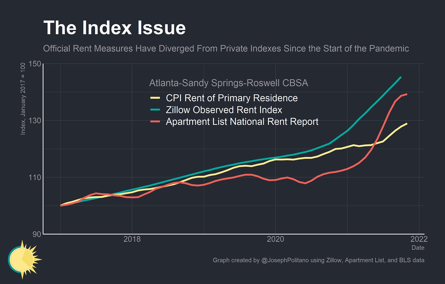
Or look at the Atlanta statistical area. Both ZORI and CPI show a constant increase in rental prices while Apartment List data shows a slowdown followed by a rapid acceleration. Even still, CPI data appears to be lagging way behind the private data. What’s going on here?
It’s hard to say in the moment, and we will only be able to truly determine what happened once the pandemic has passed and full datasets are available. However, I have a theory: lease turnover. It is well-documented that rent price changes accelerate during lease turnovers and this pattern was only exacerbated during COVID. Jay Parsons, the deputy chief economist at RealPage estimates that renewal rent increases have grown at only 1/3 the rate of new leases. Continuing leases, of course, see no rent increases.
Only about 10-15% of the CPI sample are new leases, but that number is likely much higher for apartments that are being listed on online sites like Zillow and Apartment List. Of course, these companies know this and implement measures to correct for the sampling bias of new leases. It is likely that the rapid shift in composition of rental listings caused by the pandemic simply broke these sampling bias corrections.

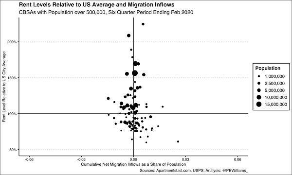
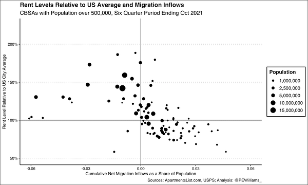
For example, Americans have been moving from high cost metros to low cost metros at abnormal rates throughout the pandemic. This could help explain the trends seen in the private data: as renters moved out of New York City and into Atlanta prices for new listings sunk in New York and jumped in Atlanta. This contributed to the breaking of the Zillow and Apartment List data—causing false jumps in the Atlanta data and false drops in the New York data. The CPI, by directly measuring rent paid by tenants on a constant sample of units, may have avoided this statistical pitfall.
I want to stress here that it will take until the pandemic settles to determine how much of the variation in private rental data was just statistical noise. I also want to stress that private data has its place and I am not discouraging use of these private datasets. They just have to be used in context and with an understanding of their methodologies to be used correctly. Indeed, I do also expect the CPI rent measurements to partially catch up with private data estimates over the coming year (although I do not expect anything near the 15% growth rates currently seen in private data).
The Rental Crisis
Many data points still indicate worryingly high rent price growth over the next year or so. For one, rental vacancy rates have been decreasing for years and hit new lows in the COVID era. Fewer vacant units indicate that demand is outstripping supply across the country and that renters have fewer options available. It is not unreasonable to presume that COVID, by forcing some people to work from home and preventing many people from participating in outdoor and travel activities, represented a positive demand shock to housing.
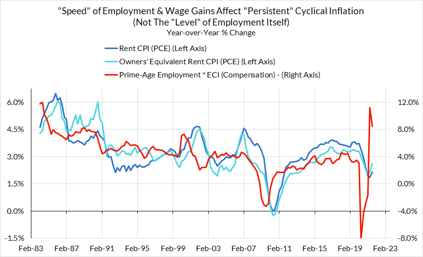
This is compounded by the high levels of employment and wage growth the US is experiencing. As Matt Klein explains, rent prices in the US are mostly a function of aggregate incomes as consumers simply cannot spend more than a certain percentage of their earnings on housing. Given that aggregate disposable personal income is currently marginally above-trend, it stands to reason that housing costs will climb above-trend shortly. Since income for low-wage workers is also growing faster than income for high-wage workers, rents on lower-priced units may also accelerate. Indeed, Skanda Amarnath explains that the rapid growth in employment and income over the last year should translate into elevated household formation and rental price growth. This will still likely be in the ballpark of 4.5-5% annual growth, not the 15% predicted by private sector rent indexes.
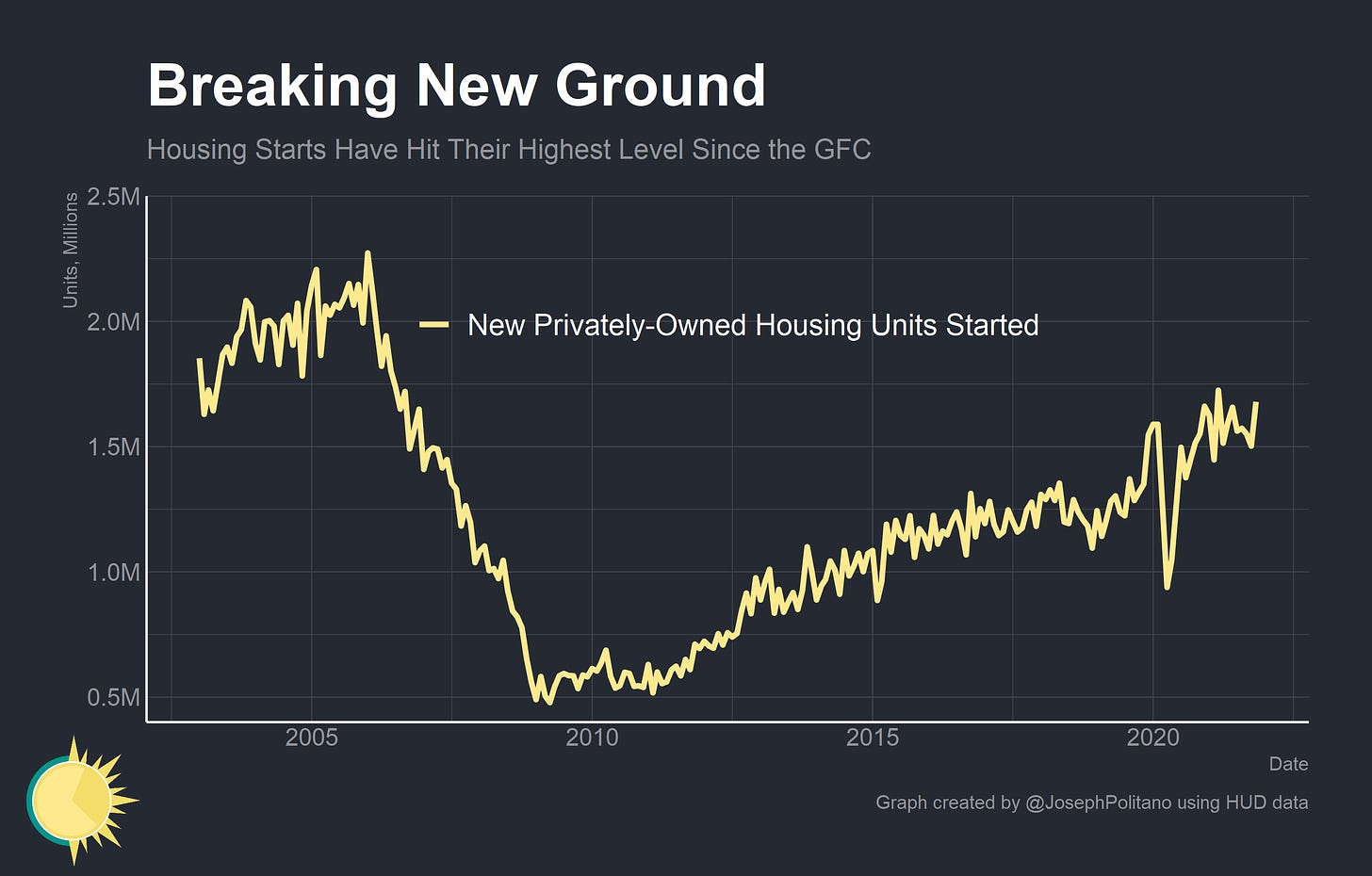
If there is one silver lining to the current housing market it is that housing construction is at its strongest level in more than a decade—even if it is nowhere near enough to satiate demand. This is another area where pandemic-fighting fiscal and monetary stimulus may have had positive effects on real output. Many real estate companies braced for a 2008-level economic collapse when the pandemic hit and were momentarily caught off guard by the surge in housing demand. They’ve been fighting back with fervor ever since. In even more good news, the movement of Americans from high-cost to low-cost metros will likely enable greater construction. Cities like New York and San Francisco have extremely strict planning and zoning rules that prevent construction while less-expensive cities tend to have laxer planning rules. Case in point: single family home permits are up nearly 50% in Dallas since the start of the pandemic.
Conclusions
The housing market is incredibly complex, and I have really only scratched the surface of important housing data. But this should be enough to impart the complexity of the situation and explain the seemingly diverging data points. Uncritically using home price indexes and private rental data to forecast or supplant the consumer price index is a recipe for disaster.
Yet it is worth acknowledging that housing policy remains one of America’s greatest economic failures. For nearly 15 years, America has not built enough housing to maintain broad based economic growth. The result has been an unprecedented rise in housing prices, increased rent-burdening of low income workers, a rise in homelessness, and a massive drop in GDP. Eliminating regressive zoning restrictions and boosting housing construction will be essential to increase home affordability, fight the housing crisis, and rebuild the American economy.

